 |
Pet info for the group window
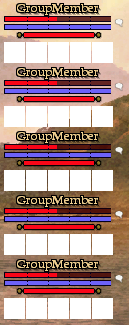
Today I started working on including the pet name, health and power for each group member in dynamic data. Originally I was going to leave this data for the modders but I think it might be nice to incorporate the pet info into the default UI. Just messing around, I lowered the detrimental effect icons and inserted the pet name and two smaller progress bars between the player power bar and the effect icons.
I would be open to a new design of the group window if anyone has some great ideas. Feel free to post some mock-ups and maybe we can come up with a new design that would look nice in the default UI. |
Nice. Since the pet can get its own impairments would it not make sense to have:
Player HP Player Power Player Impairments PlayerPet HP PlayerPet Power <-- actually I'm not sure if we even need this on the group window, but others can comment. PlayerPet Impairments You would need to pay attention to which pet you are showing though, I think (but may be wrong, have not been playing for too long) that the player's pet window is probably still buggy in sometimes showing the wrong pet (like god pets, or if you charm pets in addition to your main pet). Also not wanting to derail but DynamicData for raidwide impairments would still be great! :) |
Quote:
|
Ahh that's great!
|
On the power thing: I have played several pet classes and while pet power is crucial to know for the pet's player, I do not think group members have any reason to see it (and they can still target the pet if they really care).
Pet impairments whoever would be useful I think, but if you want to redesign a lot maybe make impairments in general toggleable since some classes do not care too much about them. |
I was thinking that the pet bars/cures would have to be smaller than the actual group members because 1). they're not important 2). to avoid confusion. And maybe even a smaller font for the pets. And I was thinking that when there are no pets in the group, it should resize back to normal or something.
These are just some thoughts. Also, doing it this way would/could be better because the player could resize it if they don't want to see the pet info. :cool:  |
Right now I'm not showing the detrimental effects for the pet. I'd have to look into how hard it would be to put that info in dynamic data. This is separate from the spell effects that you see when you target it, so it might be a decent amount of effort to make it all work.
I could understand leaving off the pet name and power if its not necessary for other group members to see, but it might make sense to have them on there for completeness and good visual appeal. My first pass already included smaller progress bars close together, so its similar to the idea of two bars in one. Here is a screenshot of my first mock-up I threw together. Keep in mind that this window needs to resize horizontally as well, so putting the pet data out to the side might only work in a vertical situation.  |
1 Attachment(s)
Not sure if the default group window can be resized but if you move the pet below of the cure icons first of all there is no confusion whom they apply to and in addition players could resize the pet out of the way if they do not care about it.
|
I wouldn't show the name of the pet to save some more space. It is still big enough to click and the pet is usually named like the player for parsing purpose anyways.
|
Quote:
I was just moving the controls into a composite so I could make the detrimental icons move up if there was no pet info. The only problem with that is when a player has the window displayed horizontally, I dont like the idea of the detrimental icons not being lined up if some players have pets and some dont. Basically you do one thing that looks good horizontally and it looks bad vertically and vice versa. Another option is we could let the client move the controls around based on a vertical or horizontal display. So if a player stretches the window tall, the pet info would move out to the right of the player name making a wider window. This way if a player didn't have a pet it would look fine. If the player stretches the window horizontally, we could display the pet below the detrimental icons so that the window becomes taller instead of wider. And again, if a player didn't have a pet it would look fine because the icons would stay lined up. |
Just to give you an idea how I would set it up.
 Leave cure curse normal size and slightly reduce the other 4 cures put the bar as a third bar and make it go almost to cure curse so. even added bullets to the sides so it stood out a little bid more EDIT: Oh and to stress when adding this make something like Gamedata.pet.window so when their pet dies there can be a command or something run. |
1 Attachment(s)
I agree something to like the above (maybe not the bigger curse icon) would work best, as it worked great in EQ1.
Just place the pet's health bar under the player's power bar and have it display thinner. So instead of 4 pixels between the players power and effects, there will be 8. 2 pixels for the pet's health... Adjust as seen fit. Here's a mock up: I think this works best as it would look fine vertical or horizontal. |
Quote:
The dynamica data is currently setup like /GameData.Group.Group_0.PetName /GameData.Group.Group_0.PetHealth /GameData.Group.Group_0.PetPower The PetName value will have its visibility toggled when there is no pet, so couldn't you script based on that show/hide? |
Thats fine, in the current gamedata Gamedata.pet.name doesn't toggle visibility. It just says "No Pet", which is the reason I mentioned it.
|
Quote:
|
Here are a few options.
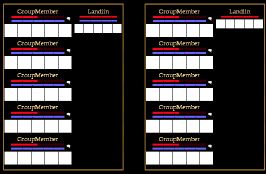
The first option is to do something like I mentioned before. We could position the pet info to the right or bottom depending on the orientation of the group window. The other option is similar to what Samijima suggested. I've decreased the icon sizes from 26x26 to 21x21 to make the group window a little more compact. Plus an even 50% scaling of the icons from the original 42x42 size will probably look better. Let me know what you guys think.  |
Quote:
Are you thinking the pet's health bar with no indicator (like the pet name) makes it a little unintuitive? That was my initial reaction to having a bar without the name label. But I could warm up to the idea especially if the mouse-over tooltip was clear. |
Personally I like the idea based on mine and Drumstix's examples. To further expand on that, I use the group window in a 3x2 set up so the other setup would cause problems for me and cause it to be massive either way. While the Idea me and drumstix presented doesn't cause any problems in any possible setup.
|
Quote:
I really think having the pet name there is redundant. It really isn't that confusing to the eyes at all. 'Specially when the bars are full. Btw, Rothgar. I think you should definitely reduce the icon sizes as you did no matter what the turn out be. Looks nice having the debuffs the same width :) |
Samejima, you bring up a good point about people that might have their group window 3x2 and we know how sensitive people are to change. :) Plus I don't really like the idea of moving UI elements within our code. Makes it harder to mod the UI.
Drumstix, I definitely think I'm going to keep the icons 21x21. Being a stickler for straight lines and "evenness" I was really excited when the icons lined up perfectly with the progress bars. The bars are 109 pixels wide if you want to keep the textures at a 1:1 ratio and 5 icons at 21 pixels each plus 4-1 pixel separators is exactly 109. Yes, the things that make me happy qualify me as a weirdo. =) |
Quote:
|
Quote:
 |
Yeah, there would be some dead space, but considering that the detrimental effects are invisible most of the time, I don't think the dead space would be that detracting from the layout. I'm finishing it up now to see what it looks like in game.
|
Quote:
Just a thought, I really do like way Dragowulf has it, maybe put the pet/s name on the pets' health bar itself. But do not have it so dark to not see the pets health. This way you can include the pet/s name and still keep everything uniform. Even if there is not pet around just have it read something like, Pet Sleeping, or something like that. But then again I am not much of a modder. Did some in Vanguard just not EQ II. |
OnHoverIn="PetName.visible=true"
That solves that :rolleyes: |
| All times are GMT -5. The time now is 08:13 AM. |
vBulletin® - Copyright ©2000 - 2024, Jelsoft Enterprises Ltd.
© MMOUI